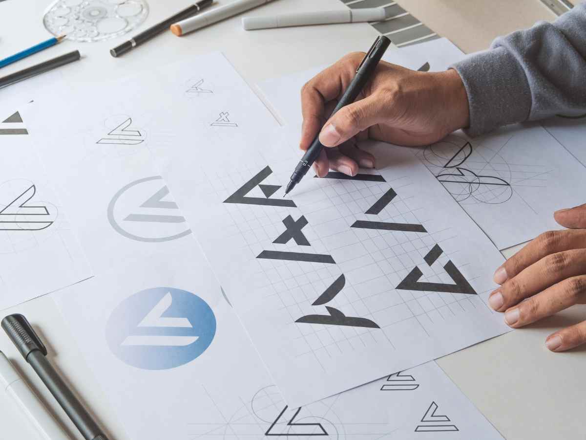
Have you always heard about visual identity, but don’t know exactly what it is? In short, it’s “the set of visual elements that represent a” company or professional and distinguish them from competitors.
We’re talking about logo, colors, fonts, website, and graphic materials, all elements that must be consistent with each other to strengthen brand recognition. A well-constructed visual identity is not just about aesthetics: it’s a powerful communication tool, capable of conveying values, personality, and professionalism.
Let’s see together what visual identity is for and how to build an effective one.

Why Is Having a Visual Identity So Important?
If you have a company, a freelance business, or a start-up, visual identity is essential for market positioning. It’s not just about having a nice logo, but communicating who you are in a consistent and professional way.
Here’s why it’s so important:
- It creates a strong and recognizable identity for customers.
- It distinguishes your brand from competitors.
- It increases brand awareness.
- It strengthens your reputation.
- It makes your message more effective.
- It facilitates communication across all channels.
A well-crafted visual identity is not a luxury, but a necessity if you want to succeed in today’s market.
How to Build an Effective Visual Identity?
Creating a visual identity requires attention to detail and a strategic vision. Follow me because I’m about to point out the essential elements for a brand identity that is solid and consistent.
1. Logo: The Heart of Your Visual Identity
A well-made logo is simple, recognizable, and represents the brand’s values. It must work on every medium, from the website to business cards, and be legible in any size.
In addition to the logo, it’s useful to create a brand manual, a document that defines the rules for using the logo, such as colors, dimensions, and graphic variants. This will help maintain consistency across all brand applications.
2. Color Choice: The Emotional Impact on the Audience
Colors play a fundamental role in brand perception. Each shade conveys different emotions and sensations. Red, for example, represents passion, energy (see Coca Cola and Ferrari), blue reliability and professionalism (Meta, IBM).

Furthermore, green is synonymous with balance and well-being (Starbucks, Whole Foods), yellow indicates optimism, positivity, creativity (McDonald’s, Ikea) and purple luxury, elegance,
originality (Milka, Hallmark).
3. The Font: The Style of Your Communication
Typefaces (fonts) must reflect the brand’s personality and be legible in every context.
It’s better to avoid overly decorative or complex fonts. The ideal is to choose a main font for the logo and headings and a secondary one for the body text, maintaining consistency across all communication materials.
4. The Importance of Images and Patterns
In addition to logo, colors, and fonts, images, icons, and graphic elements also contribute to building a strong identity. A good photographic style can reinforce the brand’s message and make it more recognizable.
Some brands also use graphic patterns, textures, or distinctive visual elements to make their communication even more unique.
Where to Apply Visual Identity?
Visual identity must be consistent across all communication materials, both online and offline. Here’s where to use it:
- Website: first impressions count, the design must be in line with the brand.
- Social media: post graphics, profile photos, and covers should have a uniform style.
- Business Cards and Brochures: All printed materials must adhere to the brand’s visual guidelines.
- Packaging and Merchandising: If you sell products, the packaging design should reflect your brand.
- Signage and Advertising: From advertising banners to posters, everything must be recognizable.
A well-crafted visual identity creates continuity and strengthens brand perception over time.
How to Create a Visual Identity in 4 Steps
Building an effective visual identity requires a mix of strategy, creativity, and consistency. If you don’t know where to start, follow these four fundamental steps:
- Start with the essence of your brand and define who you are, what values you want to convey, and who your target audience is.
- Study the market and competitors, observe how your competitors present themselves, what works and what doesn’t, and try to identify the best way to stand out without losing authenticity.
- Rely on experienced professionals – designers, copywriters, and strategists who can help you transform your identity into a coherent visual system, avoiding errors and improvised approaches.
- Define clear rules for brand usage with a brand manual that will allow you to maintain consistency across all channels, from the website to social media, from letterhead to packaging. The more recognizable and uniform your brand is, the more effective it will be.
With these steps, you’ll have a solid visual identity capable of making your brand stand out professionally and sustainably.

How Much Does It Cost to Create a Coordinated Image?
The cost of a visual identity varies based on the level of complexity and the professionals involved. Generally, it can start from a minimum of 500-1,500€ for logo design and color palette selection, up to 1,500-5,000€ for a complete brand identity, which also includes fonts, graphic materials, and usage guidelines.
For more advanced and customized projects, with in-depth studies and applications across various channels, the budget can exceed 5,000€.
Investing in a good coordinated image is not an expense, but an added value: it helps you stand out, increase brand recognition, and create strong and consistent communication over time.
Trust Qreativa for Your Visual Identity
Do you want to build a strong, professional, and memorable visual identity? We at Qreativa can help you create a tailored visual identity for your business.
Contact us for a personalized consultation!


