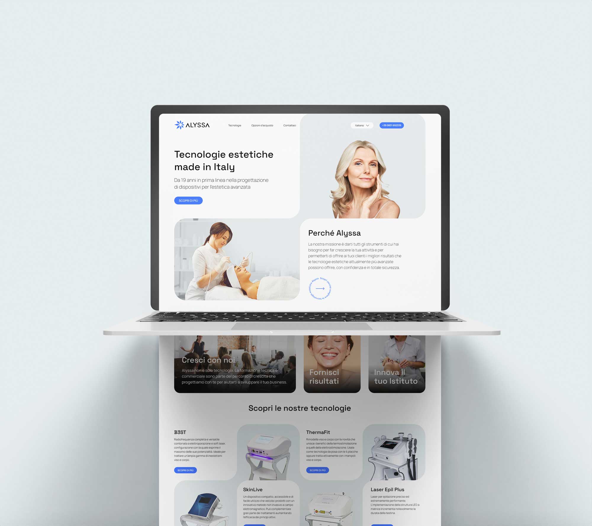
- Brand identity
- Art direction
- Motion design
- Packaging
- Web design
A beauty-technology identity designed to move.
We rebuilt Alyssa around a living visual idea: skin cells that absorb energy, vibrate and act together. That principle became the logo, pattern, motion system and a coherent language across campaigns, packaging and web.
- Client
- Alyssa by Atrex
- Industry
- Beauty technology
- Scope
- Identity & motion
- Touchpoints
- Campaign, product, web
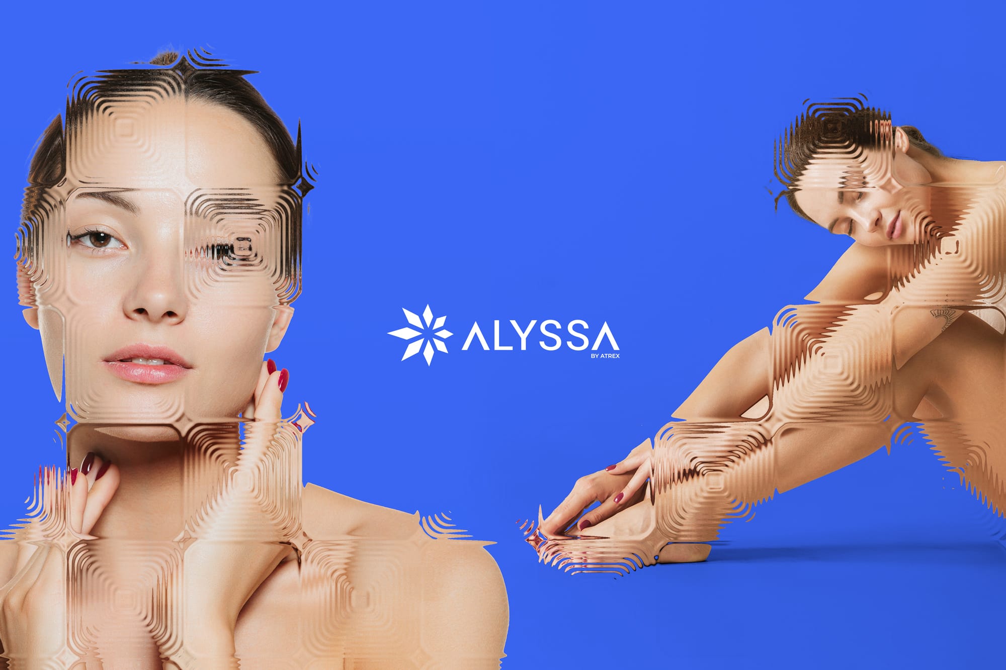
A visual idea drawn from how skin cells behave.
Alyssa works at the intersection of aesthetics and technology, so its identity needed to feel biological and engineered at once. We imagined every graphic unit as a skin cell: individually nourished, activated and set into motion, then synchronised with the cells around it. The pattern is therefore not decoration. It visualises many active parts contributing to one healthy, responsive system.
Building a symbol with memory, direction and movement.
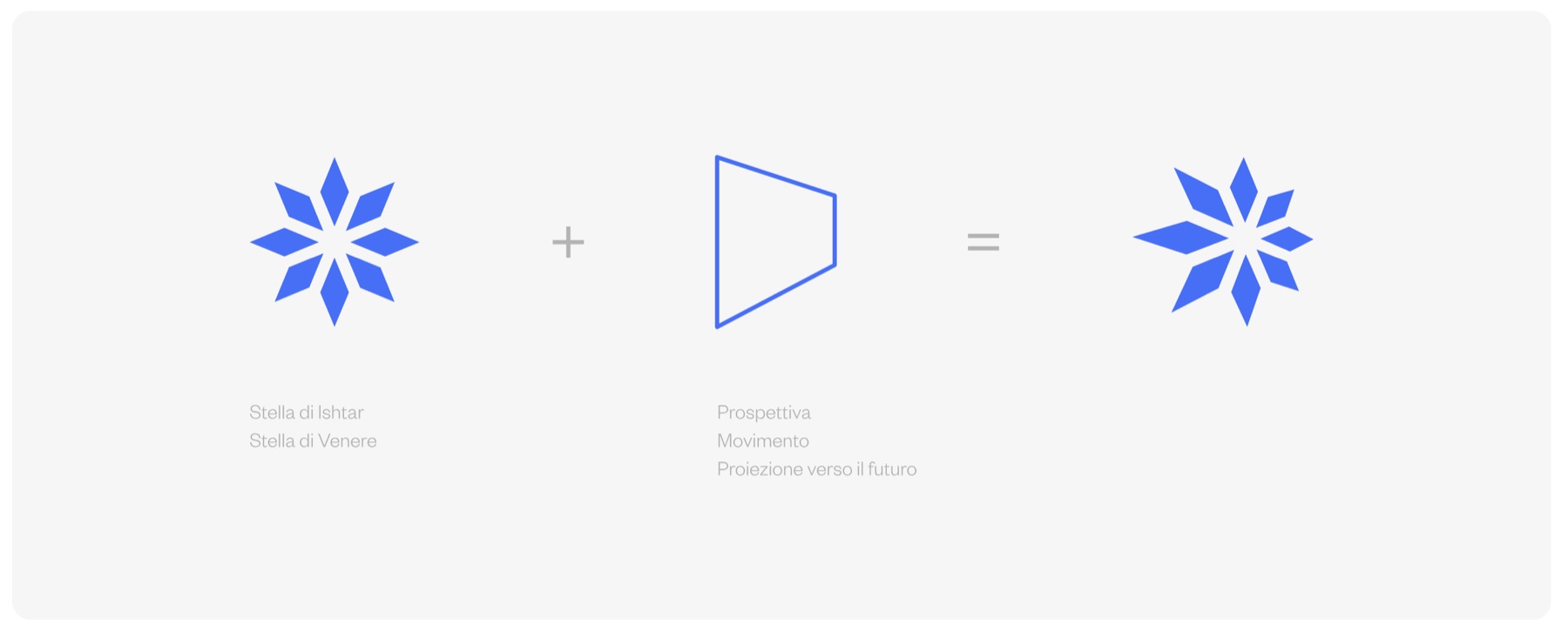
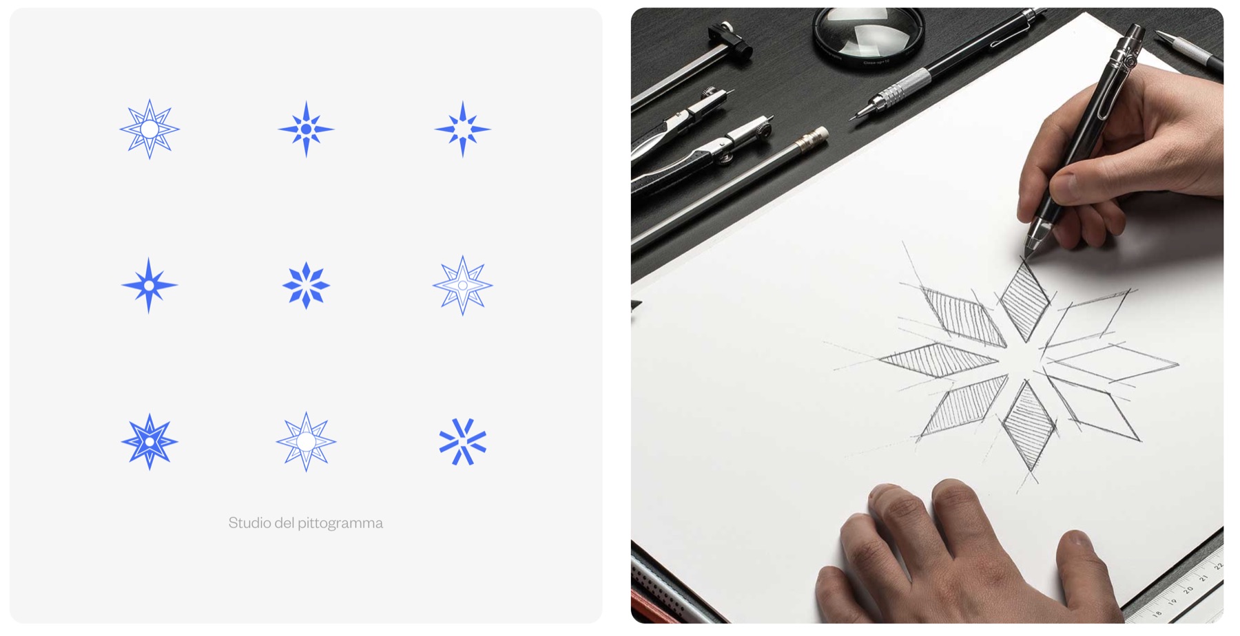
The mark combines the Ishtar or Venus star—a historic symbol of beauty—with a perspective plane that introduces projection and movement. Eight fragments radiate from one centre, echoing the cellular idea: each remains distinct, while the full meaning only appears when they work together.
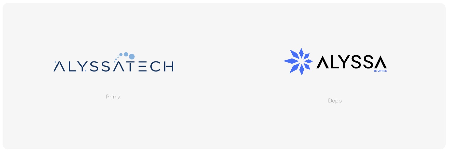
Motion was designed into the identity, not added afterwards.
Rather than animate a finished logo as one rigid object, we defined a sequence from its component cells. Energy moves through the modules, each element vibrates and the pieces settle into a shared rhythm. That behaviour can scale from a logo reveal to transitions and portrait treatments, making transformation recognisable without relying on a literal beauty claim.
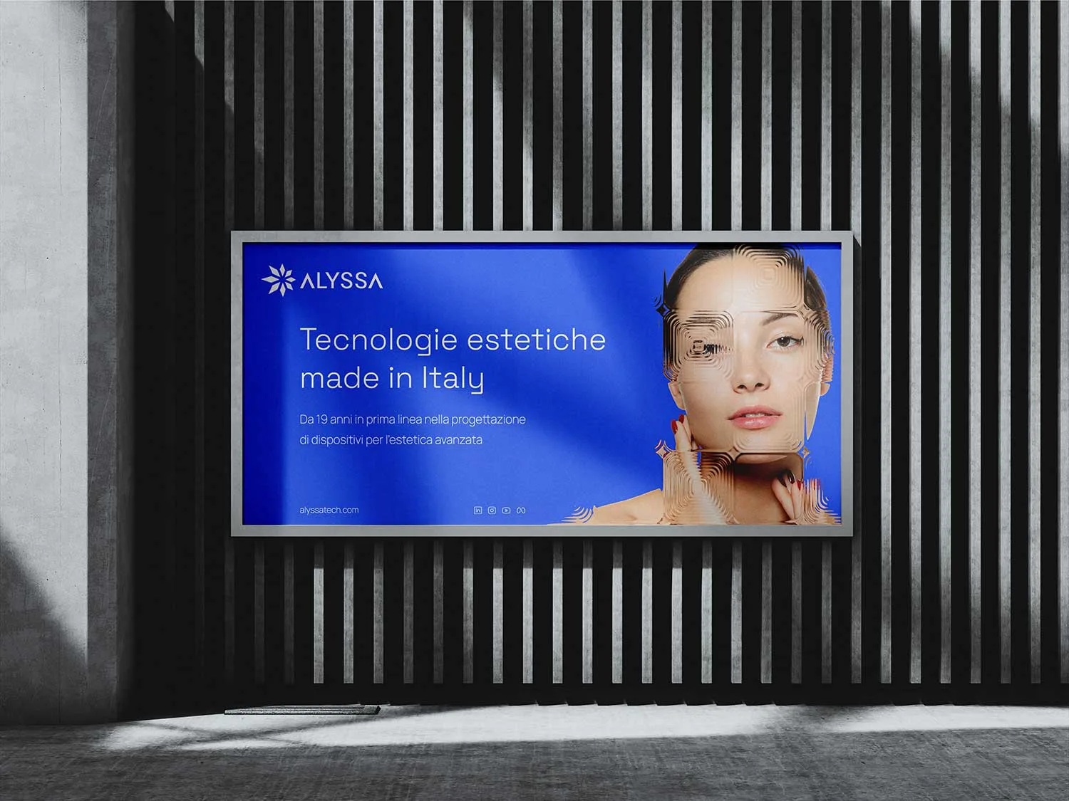
A disciplined visual system gave the motion room to breathe.
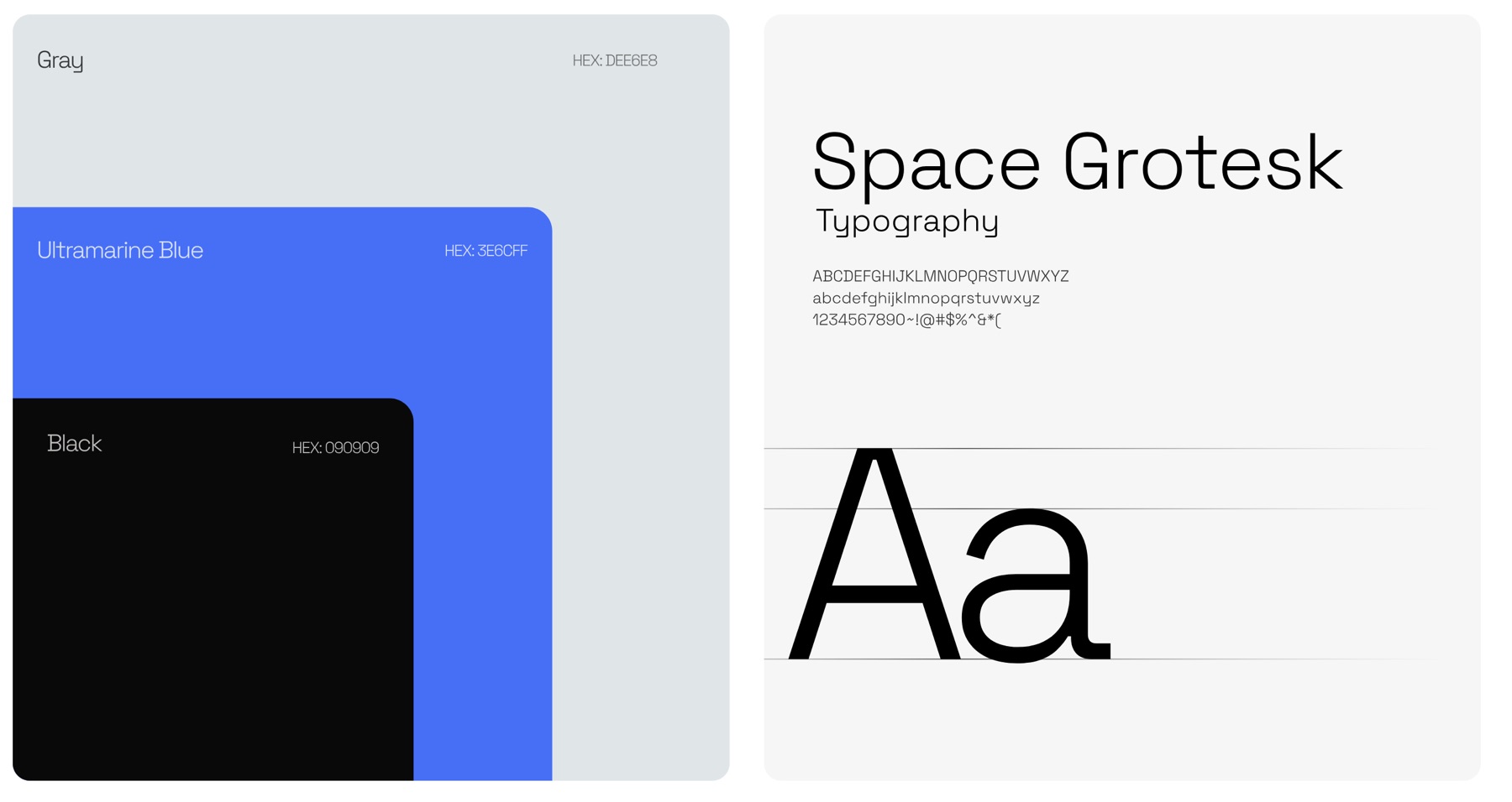
Ultramarine blue delivers energy and immediate recognition; cool grey and black create clarity; Space Grotesk adds technical precision without feeling clinical. Used consistently, these choices let the cellular pattern and campaign imagery feel expressive while product information remains calm, structured and legible.
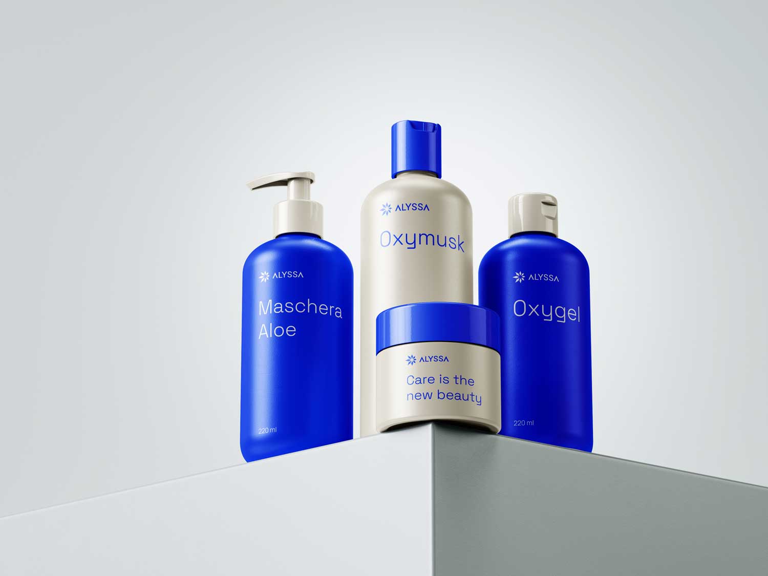
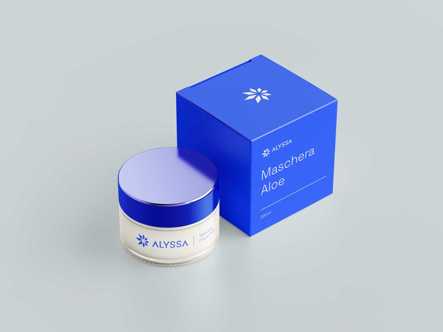
Translating the brand into a clear digital experience.
The website carries the same cellular logic into image crops, modular sections and moments of motion without competing with the information beauty professionals need. Technologies, commercial support and brand value are organised into a calm interface, so the identity no longer breaks between advertising, packaging and the product experience.