- Web design
- WordPress development
- Landing pages
- Motion design
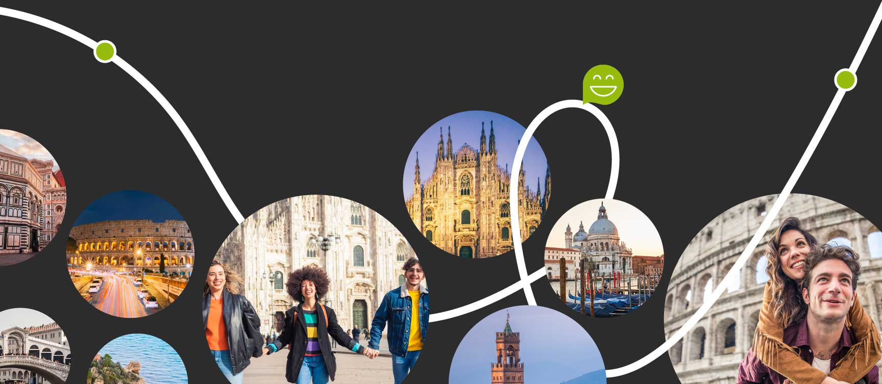
Web design & hero animation for learning Italian across Italy.
SI Studiare Italiano brings independent language schools together across Italy. Qreativa designed and developed a WordPress experience that presents them as one connected journey—centred on a moving route through five cities rather than a conventional list of courses.
- Client
- si-studiare-italiano.com
- Industry
- Italian language education
- Platform
- WordPress
- Network
- 5 Italian cities
The offer was more than a language course.
SI Studiare Italiano is a network of independent schools in Milan, Venice, Florence, Rome and Taormina. Alongside in-person, online and private lessons, its defining offer is the Giro d’Italia: students can combine two or more cities, continue at the same language level and experience different parts of the country while they learn.
A standard school website would have flattened that idea into navigation and timetables. The design challenge was to make the movement, cultural immersion and continuity of the programme understandable before asking visitors to compare course details.
The route became the organising idea.
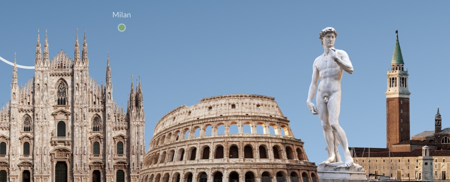
We translated the Giro d’Italia proposition into a visual path. A looping line moves between city markers and familiar Italian landmarks, giving the homepage a narrative that starts with possibility and ends with a concrete itinerary. The motion is not decorative: it explains that students can move between locations without interrupting the learning experience.
That concept shaped the wider interface. Curved paths, clear destination points, photography and a compact colour system give separate schools a shared identity while preserving the warmth of an educational and cultural experience.
Course discovery became a sequence of decisions.
The information architecture separates the questions people ask in order: where they can study, which course format suits them, what the experience includes and how to enquire. Programme pages and landing-page sections move from inspiration to practical details without making visitors assemble the offer from several school websites.
Calls to action stay close to the relevant context, while course categories, calendars, cultural activities and accommodation support remain easy to reach. This is the same principle behind our landing page development: each section should resolve one decision and prepare the next.

WordPress supported the people who would run the site.
The client already knew WordPress, so keeping the platform was a deliberate operational choice. The project did not introduce a new CMS simply for technical novelty. Instead, the design and development work extended a familiar editorial workflow with reusable layouts, responsive behaviour and clearer page structures.
That choice lets the team update courses, dates and supporting content without relearning the publishing system. Good web design and development must work for editors as well as visitors; maintainability was part of the user experience from the beginning.
Culture stayed present beyond the itinerary.
The programme combines language study with the context in which Italian is spoken: city life, guided activities, local traditions and travel. The visual system keeps that promise visible through people-led photography and destination imagery, balancing practical information with the character of the experience.